Brand & Style Guide
Brand
What does the AIDS Foundation Chicago logo mean?
Imperfection is humanity – it’s our greatest strength, and AFC is embracing the beauty of imperfection through its logo. Perfectionism is unachievable and drives discontentment. Perfectionism is a product of white supremacy culture, which must be dismantled to truly embrace racial equity. AFC represents the coming together of people – this process is imperfect; people are imperfect; this is where our power comes from…our collective and individual imperfections.
The imperfect circle is the symbol of AFC’s strength in all its humanity and imperfections. We strive for impact, innovation, inspiration and quality, which we believe runs counter to perfectionism.
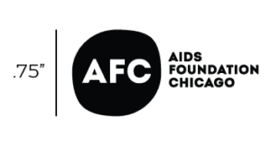
How small can it get?
We want everything in our logo to be readable to everyone. Therefore the text can go no smaller than 8pts. The logo below is the smallest we can go with our logo. Ensure the logo height is no less than .75 inches.
Approved AFC Logos
For Print
Full Color PNG (transparent)
White PNG (transparent)
For Web
Full Color PNG (transparent)
White PNG (transparent)
Unacceptable Logo Use
To ensure that AFC’s visual identity remains unified across all applications, do not compromise the logo as shown in the examples below.
![]()
Typography
Intro Black is AFC’s primary font and is the font used in AFC’s logo. It should be used consistently as a header font on all AFC communications. Intro Black in all caps should be used as the main header font, and Intro Black in sentence case at a smaller point size can be used as a subheader. A license has been purchased for all AFC staff but additional licenses can be purchased here.
Montserrat is AFC’s secondary font. It is a versatile font with 18 weights. It should be used in conjunction with Intro Black as subheaders and body font. Montserrat can be downloaded for free here.
These are the fonts that should be recognized with AFC’s brand. Sometimes the main fonts aren’t available or acceptable when putting together important documents. For emails, use a sans-serif font family, and for documents such as grant writing, letters, etc., it is the writer’s preference depending on the guidelines of a specific document, though sans-serif fonts are preferred for their legibility. All fonts should be legible, so the text should be no smaller than 8pts.
Colors
AFC’s brand identity features four colors, along with white, that can be utilized with other harmonious colors to maintain its culture of openness, innovation and inclusivity. The color information below represents the exact color values for web and print. PANTONE® (PMS) and CMYK colors are used for print. RGB and HEX values (#) are used for web or any on-screen viewing. Please make sure to use the appropriate color value when applying to print or web/screen.

Photography
AFC’s photography style is clean, bold, colorful, celebratory and people-first. Choose photos that represent AFC’s priority populations and the communities it serves in natural, relaxed and non-stigmatizing ways. Avoid images that could potentially reinforce negative stereotypes, particularly of communities of color. If possible, use photos taken by AFC staff or at AFC events by contracted photographers. If the available photos do not meet the needs of the design brief, stock photography is acceptable, but be sure to use high-quality stock images that show priority communities in a natural, non-stigmatizing and approachable ways and avoid stock imagery cliches.
The official AIDS Foundation of Chicago Flickr account can be found here.
Questions?
Contact the Communications Department at [email protected].
View the full AFC brand guide here and click here for a one page summary.